

As a kid, I believed that to be an author was to be able to write easily. I assumed that authors sat down at their desks and banged out an entire novel in an afternoon, every sentence unspooling perfectly from their fingers on the first try. Thinking this prevented me, for a long time, from believing that I could be an author. Because writing was far from easy for me. I loved doing it. But easy? No way. My sentences and stories required lots of reworking before they were just how I wanted them, before they were exactly how they seemed to need to be.
All of this is why, when I work with kids, I emphasize the importance of revision. Every presentation I give, every workshop I hold — there is always a discussion of revision, often an in-depth one, and I regularly do exercises to help make this essential part of the writing process more approachable and enjoyable. Typically, the teachers of the kids I work with are extremely grateful for all this. Revision, they say, is something their students usually don’t want to talk about, much less do. But revision isn’t just an essential part of the writing process — it’s an essential part of the creative process. Any kind of creation.

If you follow me here and/or elsewhere, you’re no doubt aware that I’m an advocate for visual learners, and that I believe that visual literacy does not get the respect and attention it deserves in our schools and classrooms (though there are plenty of incredible teachers fighting against that trend, and I’m honored to call so many of them colleagues and friends).

As kids, we all draw. We draw long before we can write. And mark-making — even that done by a toddler — is a form of expression, an attempt at communication. But something happens as we grow older. So many of us stop drawing. And for some reason that is frustratingly unfathomable to me, we begin to believe that drawing, that visual expression and communication is something we either can or can’t do. It’s an either/or. We’re either born with it or we’re not.
And all of this is why, when I work with kids and adults, I emphasize the importance of revision in illustration. Because somewhere or other, as we age, we’re disabused of the notion that an author can effortlessly write an entire novel in an afternoon. But the same can’t be said of the myths that get built up around illustrators, or even just people who can, and do, draw — people who, in other words, can express themselves and communicate clearly with images as opposed to, or in addition to, words.
Recently, to try and further dispel some of these myths, I shared on social media a bit about just how much work goes into the creation of the art for a book cover. Again, if you follow me here and/or elsewhere, you’ve no doubt seen this:
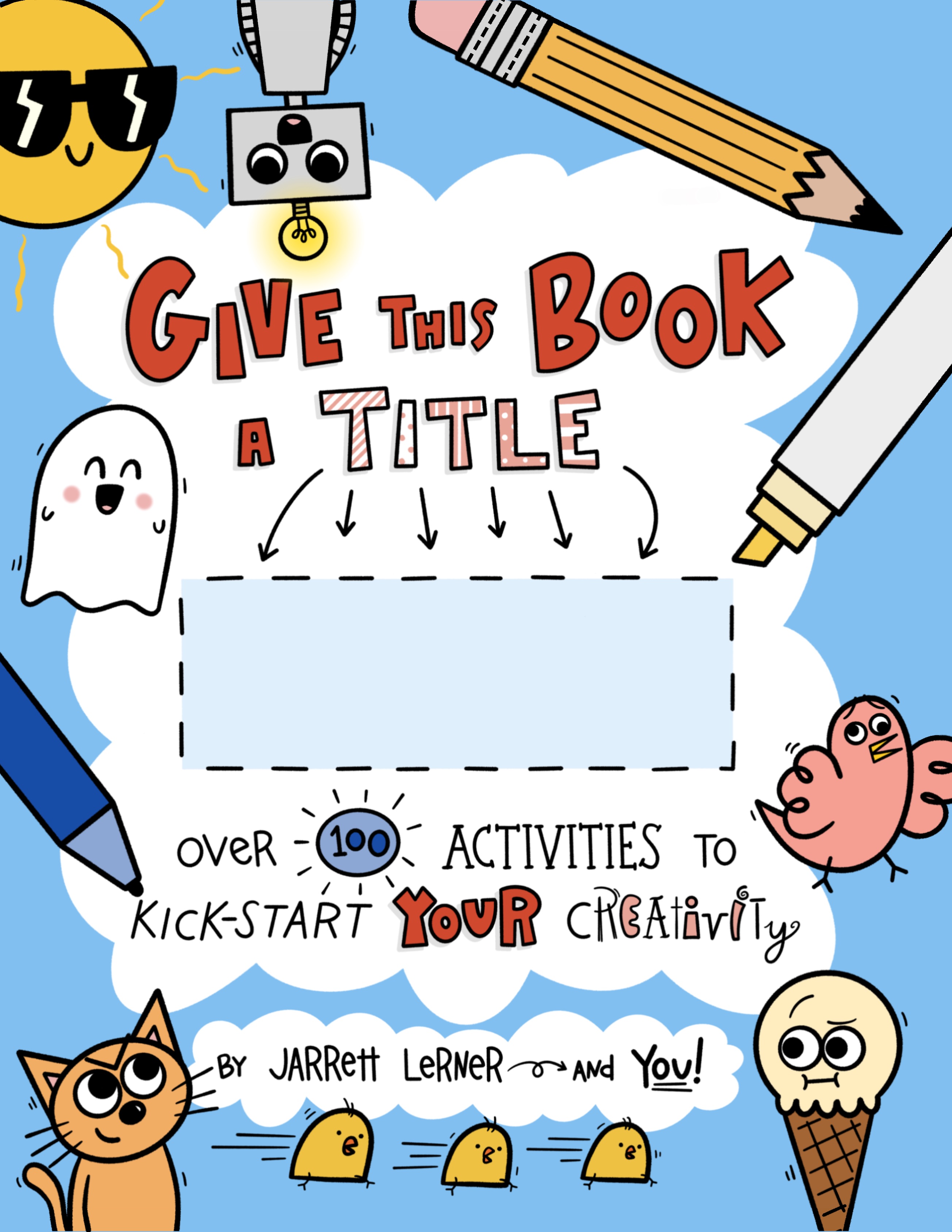
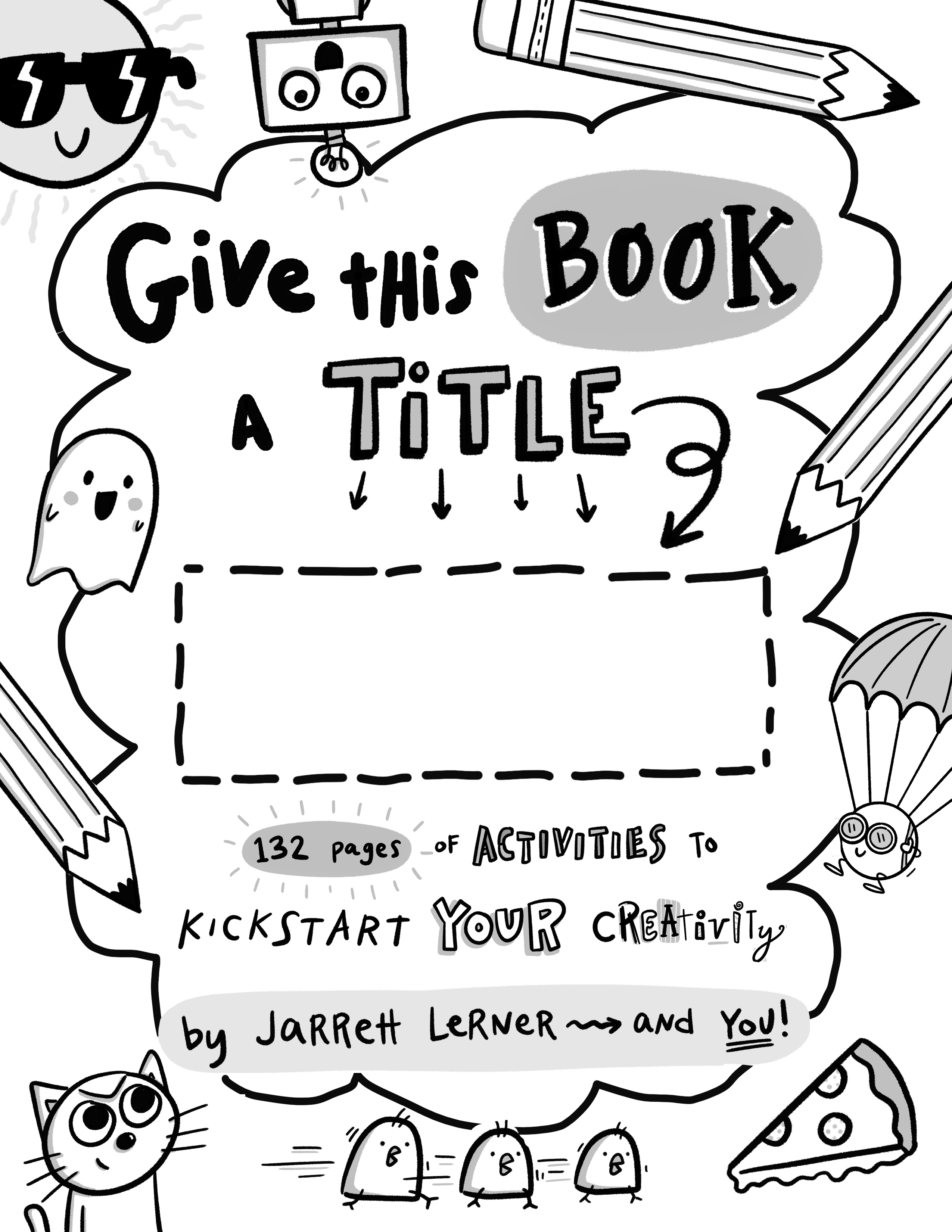
This, of course, is the cover of Give This Book a Title, my first activity book (which comes THIS Tuesday, December 15th, by the way!). And this artwork — just like every single illustration inside the book — was the end product of a long process, one filled with revision and all the things that come along with it (the missteps and mistakes, the detours and doubts).
The process began, more or less, here (I say “more or less” because even this rough drawing was revised many times before it was passed along):
This is a cover art mock-up I made to go along with the book proposal that my agent and I sent out to publishers. I shared it knowing full well that, if the book sold, everything about it might change — and not just the layout or composition, but even the title. And, indeed, for a while it did. Because after the book sold and I began to work with an art director, we decided to explore alternate cover ideas. I explored some different concepts in a sketchbook, filling pages of pages. Out of all that messy meandering came just one solid, shareable idea.

A meeting was had. My editor, my art director, and I spoke at length about these two different cover concepts. We analyzed them and reanalyzed them. We tried to imagine ourselves seeing the covers for the first time — on a computer or on a phone or in a bookstore, as a kid or a teacher or a parent. We made lists of pros and cons, things we liked and didn’t like. And over the course of the conversation, and the days that followed, the items on those lists often flip-flopped, as we re-reanalyzed and thought of something we hadn’t considered before.
And then, finally, we made a decision. We went with the original concept. And that was when the work really began. First, my art director sent me this:
It was a revised version of my original mock-up, with several subtle but extremely significant alterations. For instance, the subtitle was made smaller. The cloud shape was inserted — which, even in this somewhat crude, black-and-white state, my art director knew would add depth to the cover and help set the words off against the images. My art director also gave more life and energy to the drawing by angling some of the extra images she included (like the pencils). All together, these seemingly minor changes create a more cohesive and excitingly complex cover.
With this mock-up as my template, I created a tighter ink drawing:
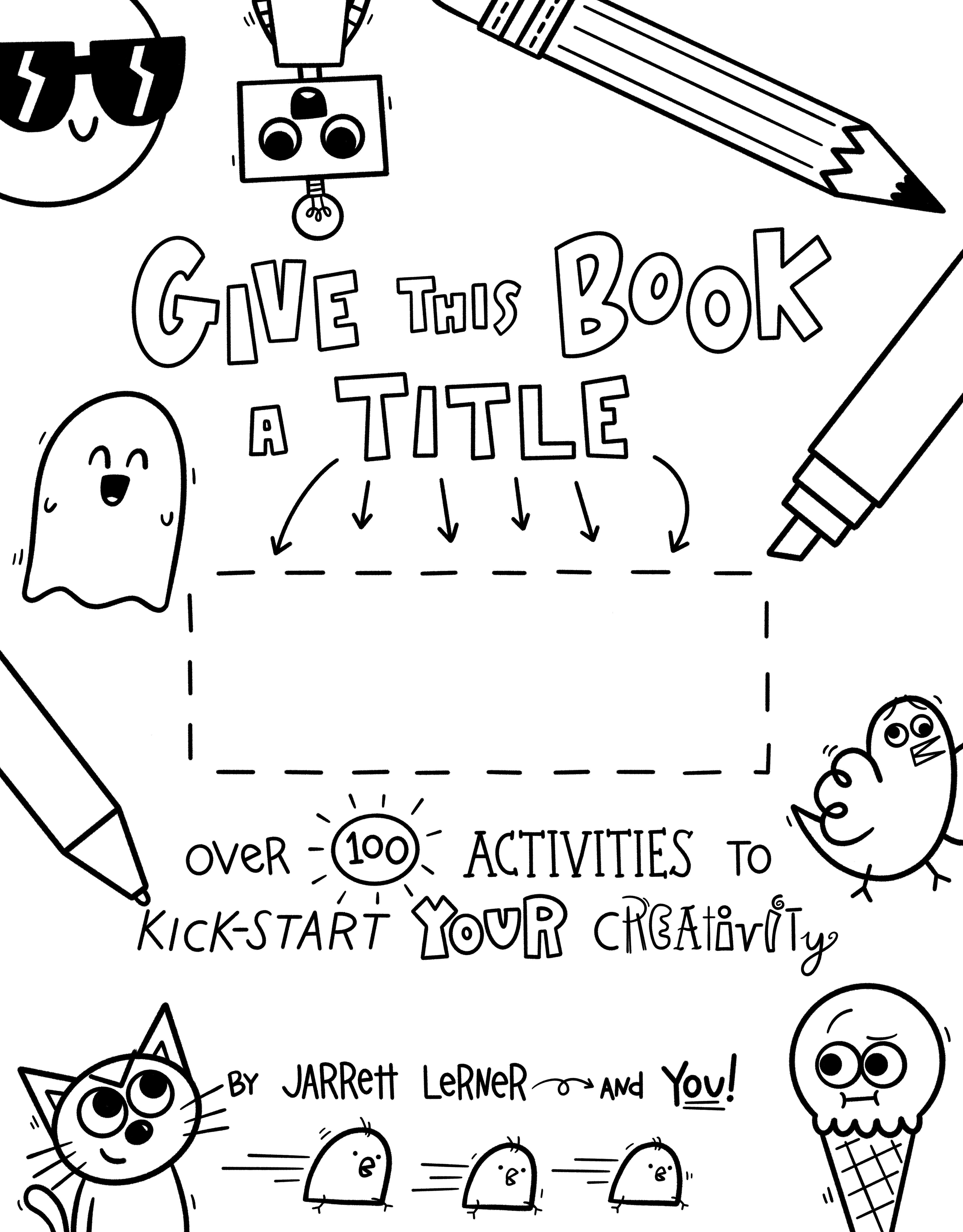
(Note, though, that this is the final version of the ink drawing. It went through many rounds of revision — I replaced the parachuting dot with the frantic bird, the oozing pizza with a skeptical ice cream cone, the surprised ghost with a giggling one, and two of the pencils with other writing/drawing implements, and, as you’ll see below, briefly removed the sunglasses-wearing sun and sprinting chicks, only to put them back — before we arrived here.)
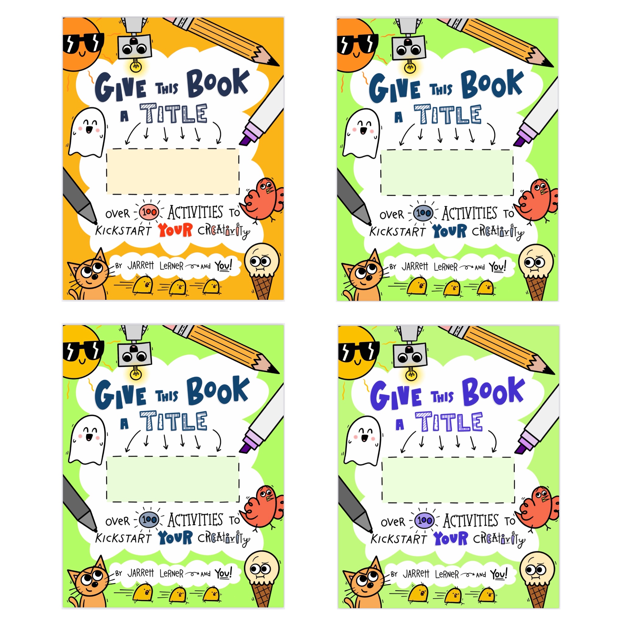
Once we were all satisfied with the sizing, placement, and positioning of the words and images, I moved onto coloring. This part of the process, at first, consists of one thing: play! I dropped all sorts of colors into the drawing, trying all different kinds of combinations, then sitting back and considering how I reacted to them, and how potential purchasers of the book might react to them. Eventually, I settled on a selection of colors that I liked, and sent it onto my editor and art director.
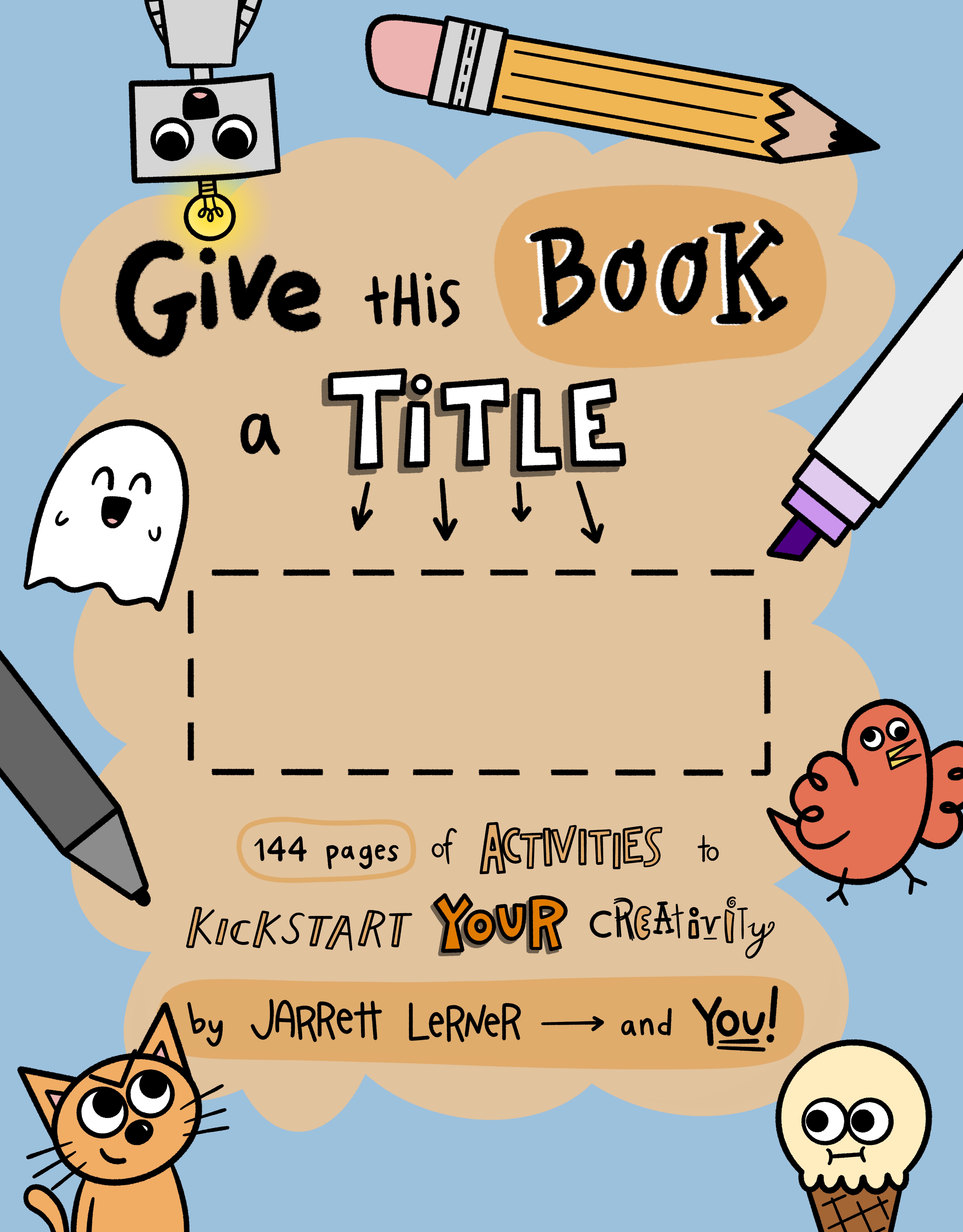
While my editor and art director didn’t hate this, they decided the color choices were too sedate. Which, basically, is another way of saying BORING. A word we kept coming back to was vibrant. We wanted this book to really leap off the shelf (or screen). We wanted it to cause people to stop in their tracks. We wanted to catch their eye, and force them to pause and take a closer look.
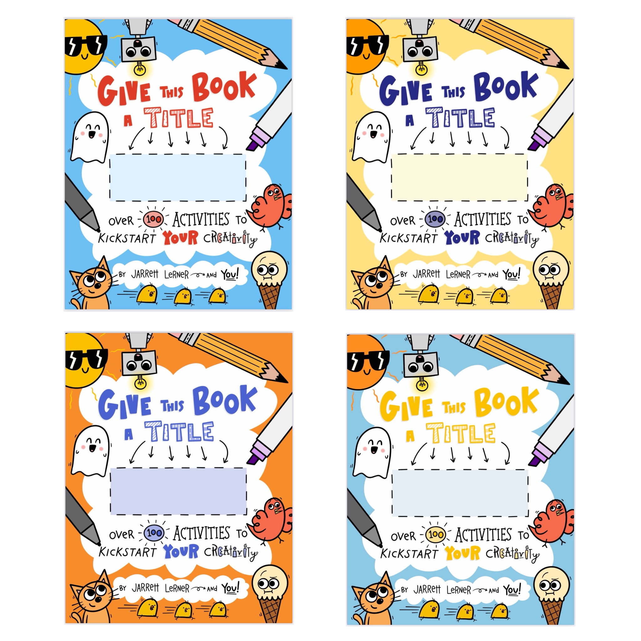
So, it was back to the drawing board, so to speak. There was more play — but this play was informed by something else. Research. I studied book covers, hundreds of them. I picked through my shelf, I headed to the bookstore (I’m always looking for an excuse to head there…), I scrolled through websites. I even studied some brand logos and clothes, trying to get a sense of all the possible color combinations there were, and trying to figure out how each one made me feel.
I came up with lots of possibilities. Like, LOTS. Let’s just say, in the end, I threw 17 — yes, seventeen — different options at my editor and art director. (See: LOTS.)
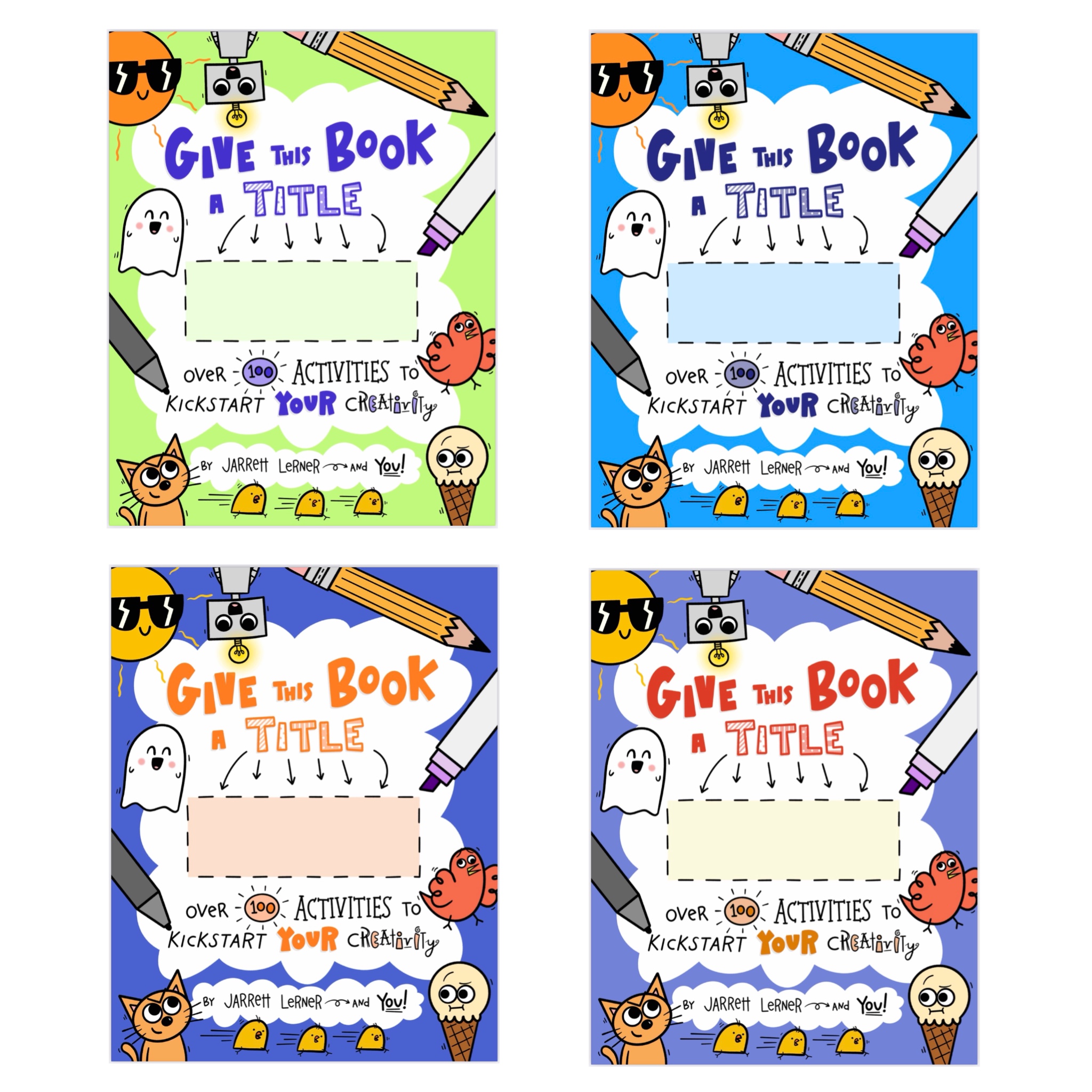
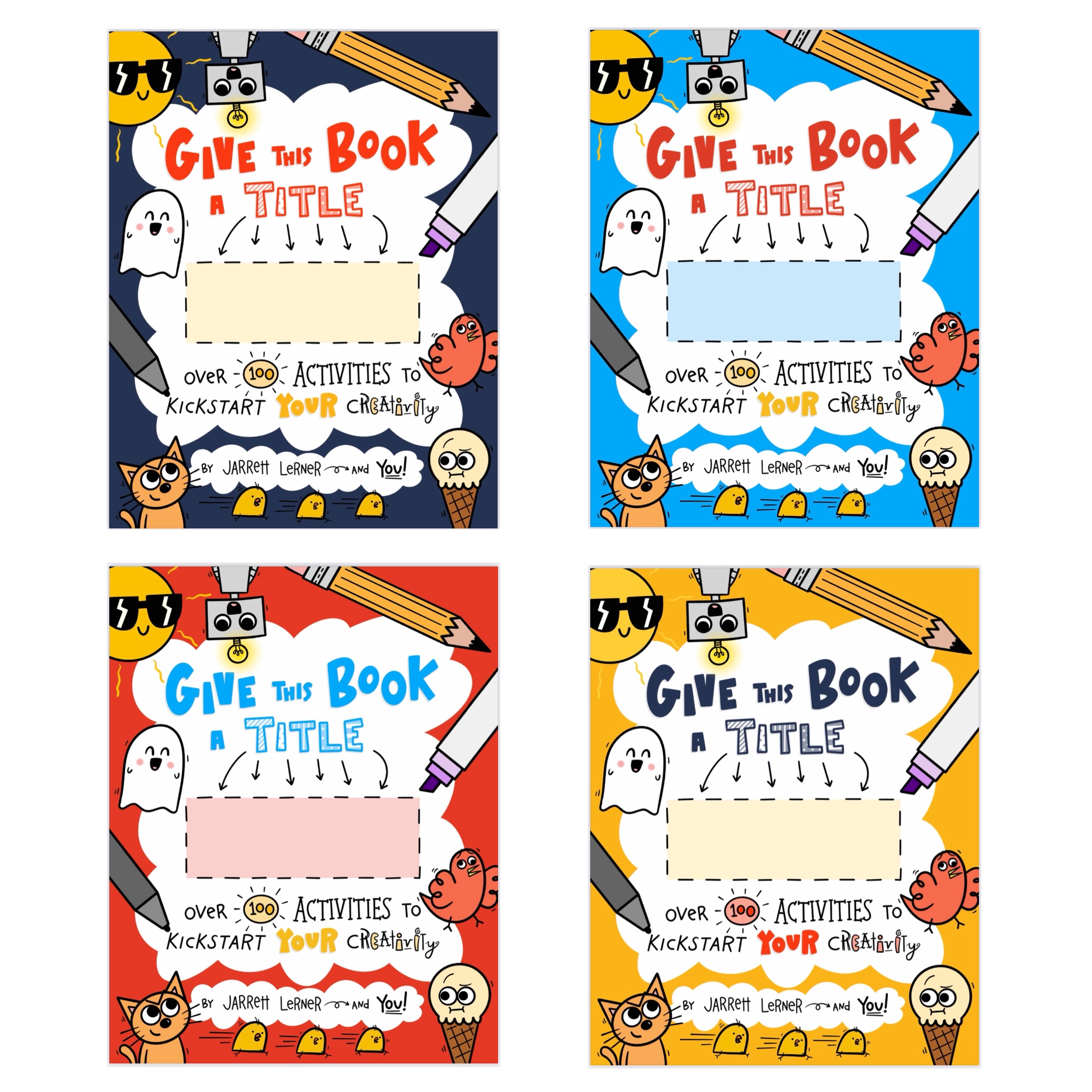
Another meeting was had. We analyzed, reanalyzed, and — again — even re-reanalyzed, and finally settled on the cover as you have now seen it.

But even this long telling of the cover-creation process doesn’t quite account for ALL the revision that occurred. It would be impossible to account for all the minor alterations that took place. How many times did I ever so slightly shift the placement of the title, subtitle, and byline? Hundreds. Easy. How many times did a just the motion and emphasis lines surrounding the characters? Maybe thousands.
I hope, if you’ve joined me on this behind-the-scenes tour of this process, you’ve gained a deeper, more informed understanding of just how much revision there is in every creative product. I often say that “writers” should really be called “revisers” — because that’s mostly what we do. When it comes to illustration, there’s no similar term for it — redrawers? re-illustrators? — but the same is true. And I believe the same is true, in some form or another, for every creative endeavor. By chipping away at the myths that surround various forms of creativity — and that often prevent people from recognizing, embracing, celebrating, and sharing their creativity — I believe we can help make the world a brighter, more beautiful, and better place.
~ Jarrett
Note: my art director for this project, who is AMAZING, is Alicia Mikles. You can learn more about Alicia and her work here. Karin Paprocki, who has served (and continues to serve) as art director for all my other books, also played a role in the directing of this project.
